Web App and Conference Paper
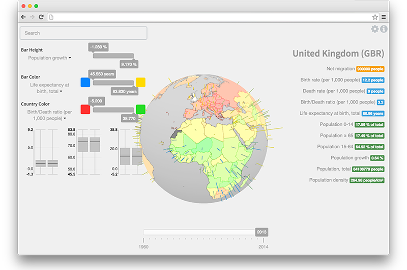
Living Globe is a Three.js application for tri-dimensional worldwide data visualization. It allows the simultaneous representation of multiple indicators as spatial structures (bars and other objects located in a specific latitude-longitude on the globe). The mapping of data to the provided visual structures is configurable by the user, introducing an aspect of customization which encourages a more immediate, visual-only interpretation of the data. Additionally, the represented data is normalized within an adjustable scale. This can be used to filter out extremely high or extremely low samples, uniforming the remaining data and improving its visibility.
Our prototype was developed with demographic data in mind, like total population, density, population-growth, life expectancy, net migration, crude birth rate, crude death rate and the ratio between the last two. However, today it actually allows the visual exploration of the any kind of numerical data structured in JSON by year and by country. We provide two example input files: “input.json” (containing demographic data between the years 1960 and 2014) and “input_alt.json” (containing miscellaneous data regarding finance, demography and employment between the years 1960 and 2014).

While offering inexperienced users a default mapping of these data variables into visual variables, Living Globe allows more advanced users to select the mapping they intend to use. This means that users can control over an earlier stage of the visualization reference model (Riccardo Mazza. Introduction to information visualization. Springer-Verlag London, 1, 2009) making Living Globe a more flexible tool than other similar tools.
In order to support this feature, three visual variables may be selected to map a data type:
- height of vertical bars (directly proportional to the data value);
- color of vertical bars (in a color scale ranging from blue to yellow);
- color of the countries on the globe (in a scale ranging from red to green).
An adequate selection of the data variables and their mapping to the visual variables may help the identification and study of potential relations among data variables. The time interval can be changed through a slider.
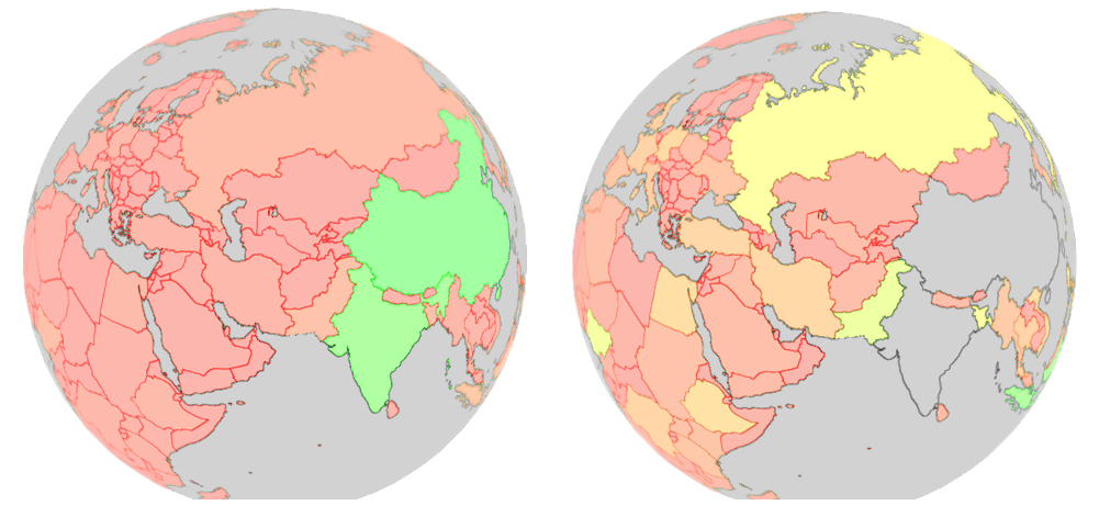
Living Globe also offers the following functionality: i) textual search, with dynamic suggestion of the countries names; ii) country selection; and iii) configuration of minimum and maximum data values; This last feature, which filters out countries that do not match the minimum and maximum values and normalizes the remaining data set, can potentially lead to improvements in the interpretation of data in countries with small samples (eg. Portugal) by filtering out countries with large samples (e.g. China).

This application can be tested here. It is built with Javascript ES6, jQuery, three.js and chroma.js, and the codebase is open-sourced on Github.
Publication
Throughout research, the usability of this app was tested by agnostic individuals, and the results indicate that the data filtering and customizable mapping features encourage a faster interpretation of relational information.
A research paper describing the implementation of Living Globe, as well as a discussion of the results from the usability tests above, was published in HIMI 2016: Human Interface and the Management of Information: Information, Design and Interaction, volume 9734, pages 14-24. The full text can be read on Springer or arXiv.
To cite this paper, you may use the following BibTex record:
@InProceedings{EdDuarte/hcii2016/living-globe,
  author = {Eduardo Duarte and Pedro Bordonhos and Paulo Dias and Beatriz Sousa Santos},
  title = {Living Globe: Tridimensional Interactive Visualization of World Demographic Data},
  booktitle = {Human Interface and the Management of Information: Information, Design and Interaction},
  pages = {14--24},
  year = {2016},
  publisher = {Springer International Publishing},
  isbn = {978-3-319-40349-6}
}
Talk
The paper and prototype described in this page were presented on the 20th of July 2016 at the HCI International 2016 in Toronto, Canada. It was originally presented in portuguese on the 13rd of November 2015 at SciTecIN 2015, University of Coimbra, Portugal. Below are the slides used for those presentations, hosted on Speaker Deck.
- Dubel, S., Rohlig, M., Schumann, H., Trapp, M.: 2D and 3D Presentation of Spatial Data: A Systematic Review. In Proceedings of 3DVis@IEEEVIS2014: Does 3D really make sense for Data Visualization? pp. 11-18 (2014)
- Mazza, R.: Introduction to information visualization. Springer-Verlag London, (2009)
- Robertson, G., Card, S., Mackinlay, J. Information Visualization using 3D Interactive Animation. In Commun. ACM, vol. 36, no. 4, pp. 57–71. (1994)
- Shneiderman, B., The eyes have it: a task by data type taxonomy for information visualizations. In: Proceedings of the IEEE Symposium on Visual Languages, pp.336-343 (1996)
- Sousa Santos, B., Dias, P.: Evaluation in Visualization: some issues and best practices. In: SPIE Conf. Electronic Imaging, Vol. 9017: Visualization and Data Analysis 2014, pp. 90170O-1-8. SPIE, San Francisco (2014)
- Nielsen, J.: Heuristic evaluation of user interfaces. In: Proceedings of the ACM CHI’90 Conference, pp. 249–256 (1990)
- Dix, A., Finlay, J., Abowd, G., Beale, R.: Human-Computer Interaction, 3rd edition. Prentice Hall, (2004)
- Nielsen, J.: Finding usability problems through heuristic evaluation. In: Proceedings of the SIGCHI Conference on Human Factors in Computing Systems, pp. 373–380 (1992)
- Tory, M., Möller, T.: Human Factors in Visualization Research. In: IEEE Trans. Vis. Comput. Graph., vol. 10, no. 1, pp. 72–84. IEEE (2004)
- Tory, M., Möller, T.: Evaluating visualizations: do expert reviews work? In: IEEE Comput. Graph. Appl., vol. 25, no. 5, pp. 8–11. IEEE (2005)
- Carpendale, S.: Evaluating Information Visualizations. In: Kerren, A., Stasko, J., Fekete, J. D., North, C. (eds) Information Visualization: Human-Centered Issues and Perspectives, pp. 19 – 45. Springer, (2008)
- Zuk, T., Schlesier, L., Neumann, P., Hancock, M. S., Carpendale, S.: Heuristics for Information Visualization Evaluation. In BELIV’06, pp. 1–6. ACM, New York (2006)
- Forsell, C., Johanson, J.: An heuristic set for evaluation in information visualization. In: Proc. of AVI 2010, pp. 199–206. ACM, New York (2010)